


HindeSight Letters #82 October 2021 Newsletter - FREE TO READ ARCHIVED EDITION


This archived edition of the HindeSight letter is completely free for everyone to read.
This is a taster of what you can get every month as a paid subscriber.
WHY SUBSCRIBE TO THE HINDESIGHT LETTER?
INVESTMENT INSIGHTS
Not only do we break down the reasoning behind our monthly share choices, we explain the methodology behind investing so you will learn more about strategies and how they impact your portfolio. Investing is like anything else, the more you know, the better you'll be at it and the better your decision to invest will be.
EMAIL ALERTS
You will also receive timely email alerts detailing portfolio changes to the HindeSight Dividend Portfolio #1, that covers FTSE350 stock as suggested by our Hinde Dividend Matrix and seasoned money managers. These are for immediate changes in opening or closing a position.
HINDESIGHT PORTFOLIO SELECTION
In our monthly HindeSight portfolio selection article we cover in-depth and in plain English, our reasons why we added the previous share to our portfolio with additional insights and performance data that's usually reserved for the trading floor.
OVERVIEW
Our overview features analysis, research & opinion on the latest news and current affairs and is a window into understanding factors that shape markets.
WHY CHOOSE US?
HindeSight Letters is a unique blend of financial market professionals – investment managers, analysts and a financial editorial team of notable pedigree giving you insights that never usually make it off the trading floor.
We help our paid subscribers have 100% control to build their own portfolios with knowledge that lasts a lifetime and all for the price of a good coffee a month - just £4.99 or save 2 months by subscribing to our yearly plan, only £49.99.
Our history is there for all to see, measure and research.
CONTENTS
OVERVIEW
INVESTMENT INSIGHTS
HINDESIGHT PORTFOLIO SELECTION
OVERVIEW


Early on in my city career, circa 1986, I was a US Treasury trader for Midland Montagu, the investment arm of Midland Bank, one of the big four UK banks at the time. Back then, all its operations were run from the head office located on Lower Thames Street in the City of London, the ‘Blue-box’, as it was known. While there was much activity on our second floor, where the interest rate trading division plied their wares, it was nothing compared to the foreign exchange ‘jungle’ below us, where the atmosphere could rise from a slumber to a cacophony of loud shouting, in an instant, like crowd noise at a football match. Amid a bloodbath of piss-taking and sarcasm in the quiet periods, the frenzy of the busy times with hundreds of millions in different currencies changing hands was incredibly exhilarating. Memories of walking across the FX trading floor, as the head Cable trader arose from his desk, bellowing “Get me calls!!!!” still raises hairs on my neck, as the shout triggered dozens of the surrounding people to dive on to their phones and call the 600 or so banks, who were committed to quote GBPUSD in $5-10mil as our trader tried to cover a large position. Unfortunately, those days are long gone in today’s trading rooms, technology has replaced much of the shouting on or off phone need, while the Human Resources and Compliance departments have banned all talking for the most part and certainly any fun aspects of the job. As an old broker friend has often quipped, they have more power than the Gestapo had, with none of the humour.
In the early 19th century, electrical telegraphy was in its infancy, but by mid-century, huge advances had been made, most notably by Samuel Morse, in connecting vast distances within continents with the ability to communicate.
But, while the early US commodity and equity prices were able to be easily dispersed across the US, it was still completely cut off from the UK, despite London being the world’s largest financial market. Two weeks fast steamship was the quickest method of communication across the Atlantic. But, in 1858, American and British naval ships succeeded in laying a nearly 2,000-mile cable linking Ireland and Newfoundland. It took 16 hours for Queen Victoria’s inaugural short message to US President James Buchanan to be transmitted. After much early failure, the first permanent telegraph cable was finally in use by 1866, with the first exchange rate communicated through the cable, between Pound Sterling and US Dollar, being published in The Times on 10th August 1866. The phrase “Cable” for the GBP/USD FX exchange has been affectionally known ever since. At the time, the US and the UK economies were the largest in the world and transatlantic trade was hugely important to both continents.
Nominal GBP/USD Exchange Rate since 1791
The long history of the GBP/USD exchange rate, reflects the passing of the reserve currency status from Britain, (nice historic chart, obviously I don’t agree with the Bitcoin assumption) where the “sun never set on the British empire”, to the new powerhouse of the US as the economies and passage and pricing of world trade diverged. The dominance and purchasing power of Sterling throughout the Victorian era, saw relative stability where £1 bought $5, apart from the Napoleonic war, (1810-14) and US Civil war, (1861-65) era hiccups, were all to change as the first European War-WW1 and gold standard change set the scene for the decline to the ranges we are more aware of today.


The general concept of theoretical values in exchange rate crosses has been written about and researched at length, but is outside of the scope of this article. But, further reading on the subject is worthwhile and the link below, where this excerpt came from may be a starting point.
The theory of purchasing power parity (PPP), the notion that a dollar should buy the same amount in all countries, implies that, in the long term, the exchange rate between two countries should move towards the rate that equalises the prices of an identical basket of goods and services in each country.
Any reading on the matter will no doubt mention“ long-term” value but for me, the relevance is understanding the strange relative stability of currencies over recent years, and the potential for that to change far quicker than the general perception in the more immediate term. Most major currency crosses have enjoyed this period of calm, because the world and its central bankers are basically ‘fighting the same war’, namely weak economies, with declining growth, with zero interest rates and money printing like mad men to maintain the false charade, and it’s difficult to see much difference between countries. In the past, if a single country was becoming indebted and growth was failing, the typical drop in interest rates, even without money printing might have seen inflation rise and the currency fall, some catastrophically. But, when the whole world looks like a basket case, with no interest rate differentials to speak off, and everyone playing to the same tune, the result is a kind of stand-off, like “A phoney war”.

For businesses and investors who have exposure across the globe, with assets and liabilities in different currencies, my belief is, there is an urgent need for focus on potential sharp changes and the need to avoid complacency. As some analysts make the innocuous reference, of “gap-volatility”, where asset classes levels are unbacked by fundamentals, the understanding should be very large and sharp % changes are possible.
After giving some brief history of the GBP/USD exchange rate above, it’s easiest to continue with some of my thoughts on this currency cross and a potential path. Despite Purchasing Power Parity general assumptions that Sterling is undervalued, and that the unusual early rise in UK market interest rates relative to the US, the fact is that Sterling has been on a declining trend, arguably since 1800. The elephant in the room for me is the correlation between US (World)stock market crashes and GBP/USD down trades.
The historic chart from 1971 above shows us that;
• In 2007, the Great Financial Crisis, which saw stocks plummet also saw GBP/USD collapse from 2.10 to 1.40
• In 2000, the Internet led stock market decline, saw GBP/USD drop from 1.70 to 1.40
• And even in the 1987 crash, GBP/USD declined from 1.90 to 1.50
Bearing in mind, that today’s ‘recovery’ and valuations in the US stock market are the highest ever, the outlook for GBP/USD could be very vulnerable. While any focus on Brexit, increasing isolation and the knowledge that the UK, with its large twin deficit, (Trade and Budget) has benefitted for a long while, from the “kindness of strangers”, (who we are losing fast), only adds fuel to the fire, and the rest of the fundamentals don’t look good at all.
In a prior life as a proprietary trader, I would certainly be pricing up some downside protection in GBP/USD. Maybe a 1.15 Strike Digital option, one touch-pay out, 3-6 month expiry? , I’m told the option market are putting almost 0% probability on that happening, so the bet is very cheap-relative to payout multiple. I certainly don’t think those odds are correct, and I’m sure if more work is done across the currency cross spectrum, complacency is rife relative to the potential sharp changes that can happen, as stability will be no more.


Visit hindesightletters.com for more information
INVESTMENT INSIGHTS

As I mentioned last month, I was heading to the Scottish Highlands for a half-term break, which is my best excuse for the late arrival of the HindeSight Letter this month, and also asking long-time colleague and friend Simon White, one of the founding partners and ex-managing editor of Variant Perception research to write the Insights section below.
Naturally, we spent some time at the Loch Ness visitor centre, where the sightings of ‘Nessie’ form a large part, but also the geological history and staggering facts of the Loch. The depth of 230m, outstrips the average North Sea depth of 95m, and with that cubic multiplier to its large surface area, gives a total water volume greater than all the lakes and rivers in England combined. Apparently, there is sufficient capacity, as well, for the world’s population, 10x over to fit within the 10,000 year old glacial formation.
But, I wondered, can it fit all the world’s obscene money creation of the last few years?
Preparing your Portfolio for Inflation
The balance to inflation risks in the US, and the UK and in much of the Developed Markets has shifted in recent years, a shift that has accelerated after the pandemic. Monetary policy after the Great Financial Crisis, (GFC) has been running out of road. Central banks created reserves but they could not simultaneously create demand for those reserves, and thus boost demand in the real economy.
The problem stemmed from the effects of the GFC, when companies and households became increasingly risk averse after the damage done to balance sheets. The private sector’s greater preference for saving has increasingly been met with larger government deficits to prevent the economy going into recession.
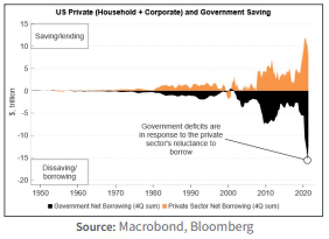
The political shifts over the last few years – specifically the rise of populism – have led to a greater willingness to increase government spending across the political spectrum to help appease a growing cohort of marginalised voters. The pandemic further fuelled this trend, with monetary financing increasingly – and explicitly – pursued.
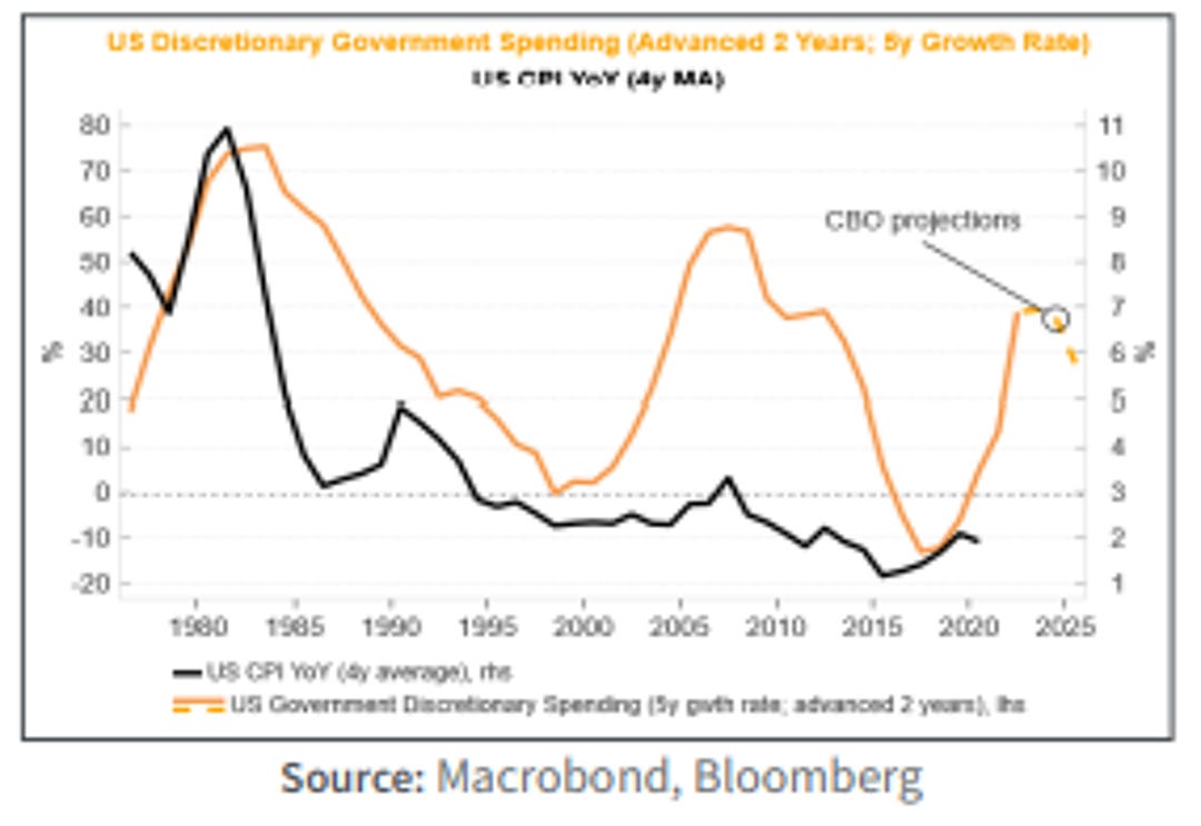
The combination of an increase in the supply of money and simultaneous demand for that money materially tilts the balance of risks towards higher inflation, which may become entrenched in the coming years. Almost all of the high and hyper-inflations of the past century, such as Brazil in 1989/90, Serbia 1992/94, China 1947/49 and Bolivia 1984/86, were preceded by the monetisation of large government deficits. We can see in the US, for instance, that rises in government spending – especially when that spending is discretionary and therefore procyclical as it is today – are associated with a structural rise in inflation.
We look to previous high inflation regimes to get a flavour of how different assets perform in real terms. Taking the 1970s to begin with – a decade pock-marked with double digit inflation and stagnant growth – we can see that cash and the traditional 60/40 portfolio did poorly.
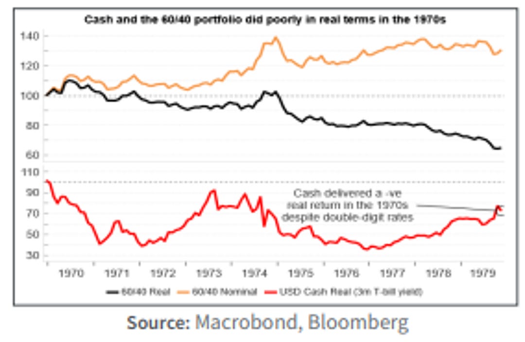
Clearly a rethink is needed on traditional portfolio construction in today’s inflationary regime. The traditional 60/40 portfolio (60% equities, 40% bonds) is positioned to fare poorly if inflation keeps on rising. But once the inflation genie is out of the bottle, it would be too late to take remedial actions. That’s why taking action today is necessary.
Let’s extend our look at previous inflationary regimes to include four distinct episodes:
1969-1970 – fiscal + monetary expansion into an already “hot” economy;
1973-1975 – Arab oil embargo and the effects of gold window closing in 1971;
1978-1980 – Iranian revolution; and 1988-1991 – easing of the Volcker shock.

We then look at median asset returns through these inflation regimes across a broad spectrum of assets. We can see that commodities and equity sectors associated with commodities had the highest real returns.

TIPS do relatively well too, whereas sectors such as financials, retail, durables and machinery do quite poorly.
Longer-term government bonds and corporate debt (both Aaa and Baa) also do poorly.
CONSTRUCTING A PORTFOLIO FOR AN INFLATIONARY REGIME
We want to create a portfolio with some real asset exposure, at the same time acknowledging that capacity in such markets is much lower than in financial assets.

So we’d suggest building a portfolio with some commodities, some UK linkers (which are the UK’s version of TIPs), and some gold. We would certainly avoid fixed income securities, both government and corporate. They are overvalued, and as we saw from the charts above on the US, tend to do poorly when inflation is elevated. We would also avoid cash as it is very unlikely to provide a positive real return.
As commodities and linkers and even gold are not everybody’s cup of tea, and we are not recommending holding any fixed-income, that only leaves equities. Equities overall tend to do poorly when inflation is high, but that masks a huge diversification. That is why we screen for companies that we think will be most resilient if inflation is staying with us.
Looking to the past is only so helpful when trying to find these inflation-resilient companies, as we expect the next 10 years to be quite different from the last 10-20 years. Beware the backtest! But we can use history as a guide and see where this gets us.
Firstly, we want companies that have shown the capacity to grow. But we are not simply going for high growth companies as many of them will be especially vulnerable to a rise in rates. We look for companies which had real revenue growth before the pandemic, and have a positive net dividend.
In inflation environments, the types of firms that are in a good position are those which are capital light, information-based companies with high pricing power. Essentially, companies that can promptly raise prices while maintaining a low fixed-cost base. This applies to many tech companies, as well as some financial companies.
Banks themselves are not an attractive inflation hedge, as they borrow short term and lend long-term, which means the real value of their assets falls more than the real value of their liabilities. But financial companies who do not lend in that way, such as some asset managers or companies that provide financial data or information, are good candidates to weather inflation well.
So we also screen for companies with a low ratio of fixed assets and high gross margins. The table below shows the screen today for UK stocks, with the cheapest first (based on EV/EBITDA)
Thank you very much for your thoughts here, Simon, on constructing an inflationary portfolio. While often, we have advocated larger cash positions in portfolios, waiting for better value, clearly in times of much higher inflation, cash values, like bond value erodes quickly, in real terms. But, there is certainly a need to understand that some equities are far better choices than others, avoiding those that have got huge growth priced in with very high p/e and other metrics, looking for more defensive options as seen currently in the HSL make up, but also others where there is growth potential as well.


Visit hindesightletters.com for more information
HINDESIGHT PORTFOLIO SELECTION
It’s always pleasant to be writing up our analysis for our HindeSight Portfolio changes when the stock has already risen from our Add notification date. We are well aware that the timing of portfolio changes is key to return potential, rather than when the report is written or read, which is the reason for our intra-month updates. The stock price has settled back somewhat in the last week, but had rallied to 923p, almost 13% above our notification in the month of October.
In our new format for HindeSight Portfolio Stock selections, we will summarise the reasons for its inclusion this month. As well as being the largest silver producer in the world, it is also the largest gold producer in Mexico with the revenue from the two primary precious metals almost equal in value.
Fresnillo’s history dates from 2008 when it was spun off from the Mexican mining company, Industrias Penoles and listed on the London Stock Exchange. With revenue and operating income in 2020 of £2.43bn and £650mil, respectively, it is a precious metal mining giant, led since 2012 by CEO, Octavio Alvidrez.

While the driving news for the last two years has been the immediate economic concerns of Covid-19 and then the ‘recovery’ as the world looked to the future, the fact that in the last 18 months, while the FTSE100 has rallied 25%, the share price of Fresnillo has dropped by over 30% seems at odds with rationale.
Clearly, some of that inverse performance will have been picked up by the HindeSight Portfolio model, especially the mean-reverting and cyclical natures of large companies and the margin of safety values. While there may be some concerns about increased input costs, the prices of gold and silver, the main revenue driver for precious metal mining companies, are within the same ranges over that period.

Economists and portfolio managers can spend much time, either side of the argument that precious metal prices and inflation rates have strong correlation or not, and as fund manager for the Hinde Gold Fund for 15 years, I have read more work on this than most. My belief is that, the correlation is very strong over the long-term, but the vagaries of “what is actual inflation-a yearly % change, or the increase in monetary base stock”, leads to more random short-term movements.
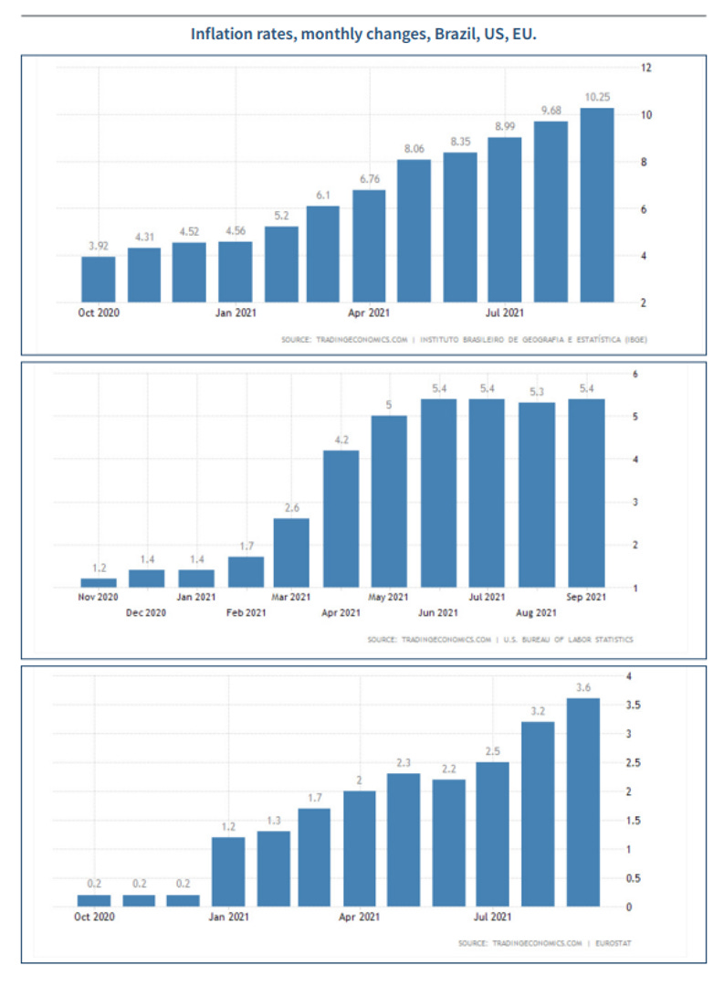
As the world is becoming increasingly aware, inflation and the general prices of goods and services are making a dramatic and unwelcome resurgence, that has been broadly absent for the best part of 40 years. Whether the current inflation rate is greater than 10% in Brazil or 5% in the US, the trend is clear for all to see.

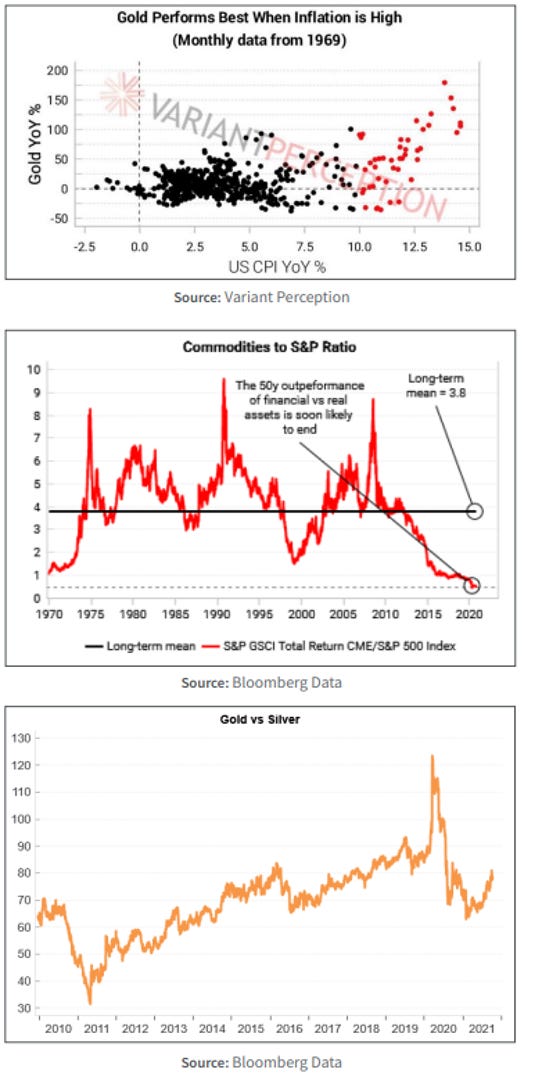
At the end of the day, the charts above are straight forward;
• Inflation is a growing issue, but with money printing insanity into its 9th year, we shouldn’t be at all surprised
• Precious metals, should reflect this, only the timing correlation is debatable
• Commodities are cheap versus general stock markets
• As a ratio, silver is pretty cheap to gold currently, relative to history, revenues for mining companies are solid and will no doubt rise.
• The large drop in mining companies stock prices in their own right of late, but is even more visible versus the rising FTSE indices
• Mining companies have their greatest free cash flow potential versus enterprise value in twenty years
As Fresnillo enters the HindeSight Portfolio, it presents an excellent risk-reward to add a large precious metal mining company like Fresnillo at the current prices, especially considering our own Insights discussion earlier about inflation proofing your portfolio.

Visit hindesightletters.com for more information